
Gallery
Hidden article.
Currently available widgets


Custom widgets for the Avanti theme


Use a shortcode to display your widget anywhere on your website

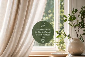
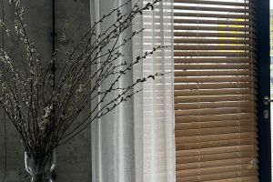
 Panele tekstylne są alternatywnym rozwiązaniem dla okien większych, drzwi tarasowych i balkonowych, w których zastosowanie rolet tekstylnych, ze względów technicznych i praktycznych, jest niemożliwe.
Szyna, na której montowane są materiałowe panele, może osiągać nawet 5 metrów szerokości, dzięki czemu zasłonimy całą największą powierzchnię.
Szeroki wybór systemów paneli pozwala na dowolną kombinację ułożenia pasów tkaniny, w zależności od potrzeb.
W ofercie Skalmar dostępne systemy*:
- jednostronny (sznurek, ręka): zsuwanie tkaniny na jedną stronę, przy czym przy sterowaniu sznurkiem skrajny panel jest zawsze stały (nieruchomy)
- dwustronny niesymetryczny (tylko sznurek): zsuwanie tkaniny na dwie strony, przy czym każdy panel skrajny z lewej i prawej strony jest stały (nieruchomy)
- dwustronny symetryczny (sznurek, ręka): zsuwanie tkaniny na dwie strony, przy czym każdy panel skrajny z lewej i prawej strony (nieruchomy)
*UWAGA: W przypadku wyboru systemu otwieranego ręką, każdy z paneli sterowany jest niezależnie i wszystkie panele są wolno jeżdżące. Dotyczy to każdego z systemów (jednostronny, dwustronny niesymetryczny i symetryczny).
Minimalna ilość torów – 2, maksymalna – 5.
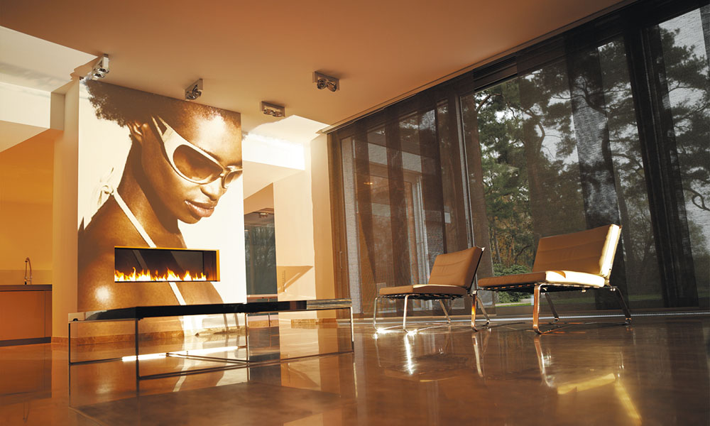
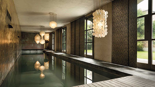
Inspiracje SKALMAR:
Panele tekstylne są wdzięcznym produktem do aranżacji ze względu na łącznie tkanin.
Minimalna ilość paneli wchodząca w skład szyny to 2, a maksymalna to 9 sztuk.
Daje to pełną swobodę połączenia różnych kolorów i rodzajów tkanin, aby uzyskać najlepszy efekt. Chcąc przełamać wizualnie powierzchnię dużego okna możemy podzielić panel 3 kolorami, włączając jeden panel we wzór. Wszystko zależy od ilości pasów, jakie będą zawieszone na szynie.
System paneli o maksymalnej szerokości 6 metrów. Ilość torów zbieżna z ilością paneli: od 2 do 5 maksymalnie.
W przypadku sterowania panelami sznurkiem, rączką lub elektrycznie zawsze jeden panel jest stały.
Wybierając sterowanie ręcznie każdy z paneli jest przesuwny.
W każdym z torów znajduje się jeden panel.
Sugeruje się wykonanie maksymalnie do 1,2 szerokości panelu – tkaniny.
Zakładka tkaniny o wymiarze +/- 5 cm.
Kolor profilu (mocowania):
Biały, silver
Kolor obciążnika dolnego tkaniny:
Biały, Silver, Czarny, Szary lub malowany na dowolny RAL
Sterowanie:
Ręczne sznurkowe, ręczne patykiem, ręczne (uchwyt magnetyczny) i elektryczne
Montaż:
Ściana, Sufit
System paneli o maksymalnej szerokości 8 metrów. Ilość torów od 2 do 5. Ilość paneli od 3 do 9 maksymalnie (ilość torów nie równa się ilości paneli)
W wariancie dwustronnym niesymetrycznym panele zsuwają się na dwie strony (na zasadzie kurtyny) po równej ilości paneli na każdą ze stron.
W przypadku sterowania panelami rączką zawsze dwa panele stałe.
Wybierając sterowanie ręcznie każdy z paneli jest przesuwny.
W każdym z torów (poza pierwszym) znajdują się po dwa panele (bez możliwości mijania tkanin).
System dwustronny niesymetryczny bez możliwości wykonania w systemie elektrycznym.
Kolor profilu (mocowania):
Biały, silver
Kolor obciążnika dolnego tkaniny:
Biały, Silver, Czarny, Szary lub malowany na dowolny RAL
Sterowanie:
Ręczne sznurkowe, ręczne patykiem, ręczne (uchwyt magnetyczny) i elektryczne
Montaż:
Ściana, Sufit
System paneli o maksymalnej szerokości 8 metrów. Ilość torów od 3 do 5. Ilość paneli od 4 do 8 maksymalnie (ilość torów nie równa się ilości paneli).
W wariancie dwustronnym symetrycznym panele zsuwają się na dwie strony (na zasadzie kurtyny) po nierównej ilości paneli na każdą ze stron.
W przypadku sterowania panelami sznurkiem, rączką lub elektrycznie zawsze jeden panel jest stały.
Wybierając sterowanie ręcznie każdy z paneli jest przesuwny.
W każdym z torów (poza pierwszym i ostatnim) znajdują się po dwa panele (bez możliwości mijania tkanin).
Kolor profilu (mocowania):
Biały, silver
Kolor obciążnika dolnego tkaniny:
Biały, Silver, Czarny, Szary lub malowany na dowolny RAL
Sterowanie:
Ręczne sznurkowe, ręczne patykiem, ręczne (uchwyt magnetyczny) i elektryczne
Montaż:
Ściana, Sufit
All widgets make use of modern web technologies
Avanti is featuring brand new and advanced Warp options.
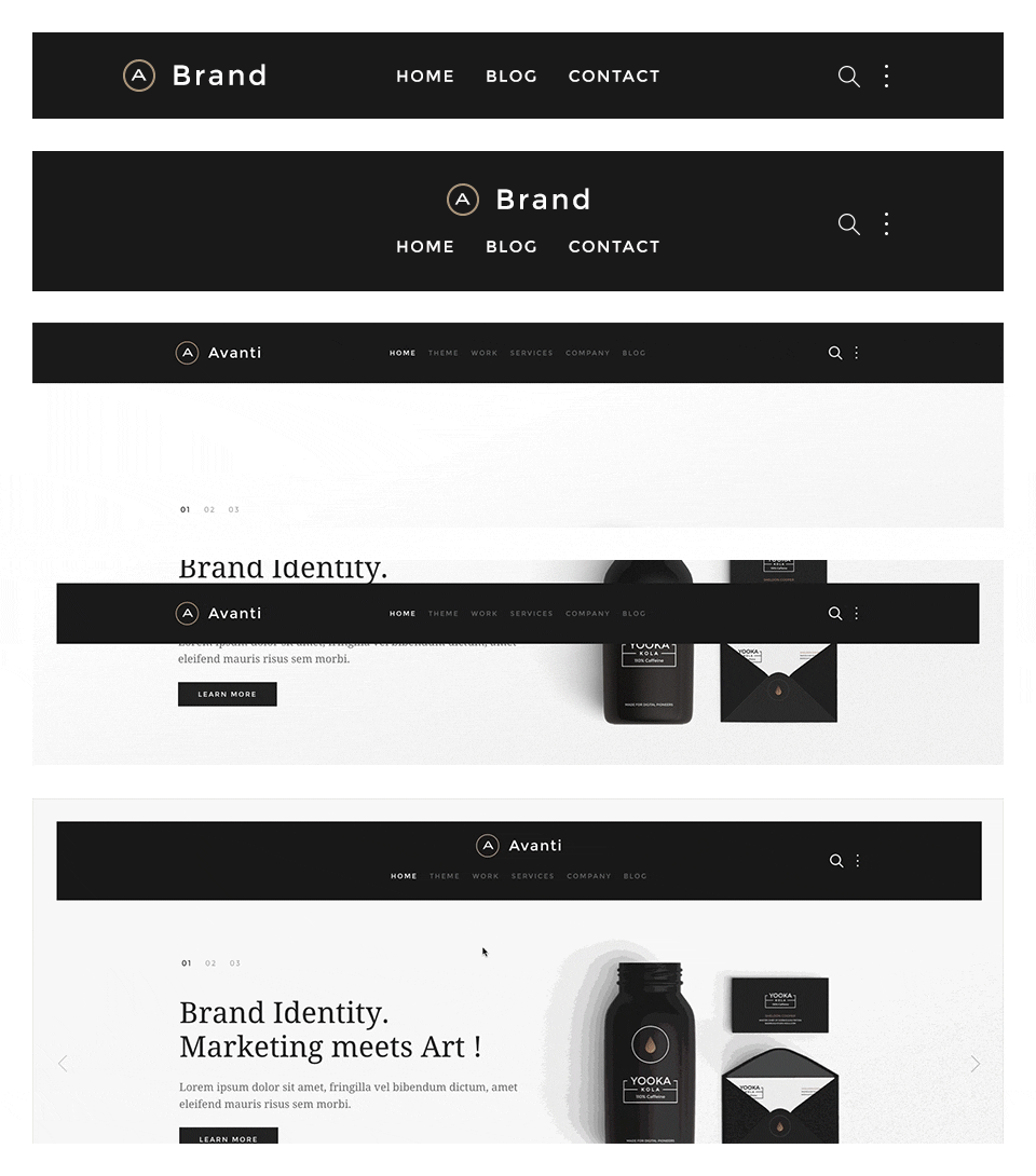
The main navigation of Avanti Theme supports the latest UIkit sticky navigation component features. You are able to select from 3 different navigation behaviors/styles and 2 layouts. The styles and the layouts can be combined. This makes 6 different navigation combinations.
If you want to support a bigger logo size or if you want to modify the navbar gutter, please use the Customizer to change the values.
If you want to change the dropdown width or color, please use the Customizer to change the values.
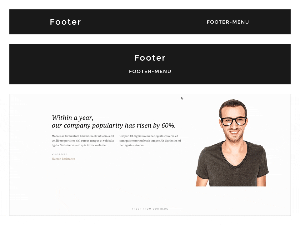
In this theme you can choose from 2 different footer layouts and combine them with the fixed footer option.
Footer Fixed: This fixes the footer block position and your website will scroll over the footer.
Enable Contrast: This option toggles the uk-contrast class from UIkit. It improves the appearance of elements when placing them on colored or dark backgrounds.
To modify the height of the footer and/or the fixed footer, please change the height values in the Customizer.
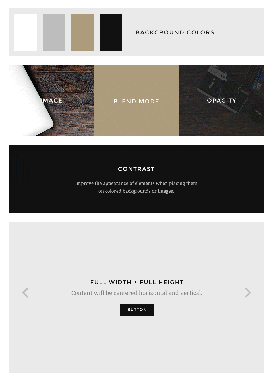
Avanti supports some useful options for all block layout positions. All settings can be combined for a block position. If you need different block settings for different pages, you can use layout profiles and assign them to your menu items.
If you want to modify the background colors or paddings of the block elements, please use the Customizer and change the values.
Additionally you have more options to customize your theme layout.
Display blog articles in a special theme specific layout. /layouts/article.php
This option centers the breadcrumbs and adds some more spacing to the following elements. Recommend for the theme specific article layout.
Zdjęcia są własnością firmy SKALMAR i są objęte prawami autorskimi. Wykorzystywanie zdjęć bez zgody właściciela Skalmar narusza prawo i będzie egzekwowane przed odpowiednimi organami państwowymi.
 English version